

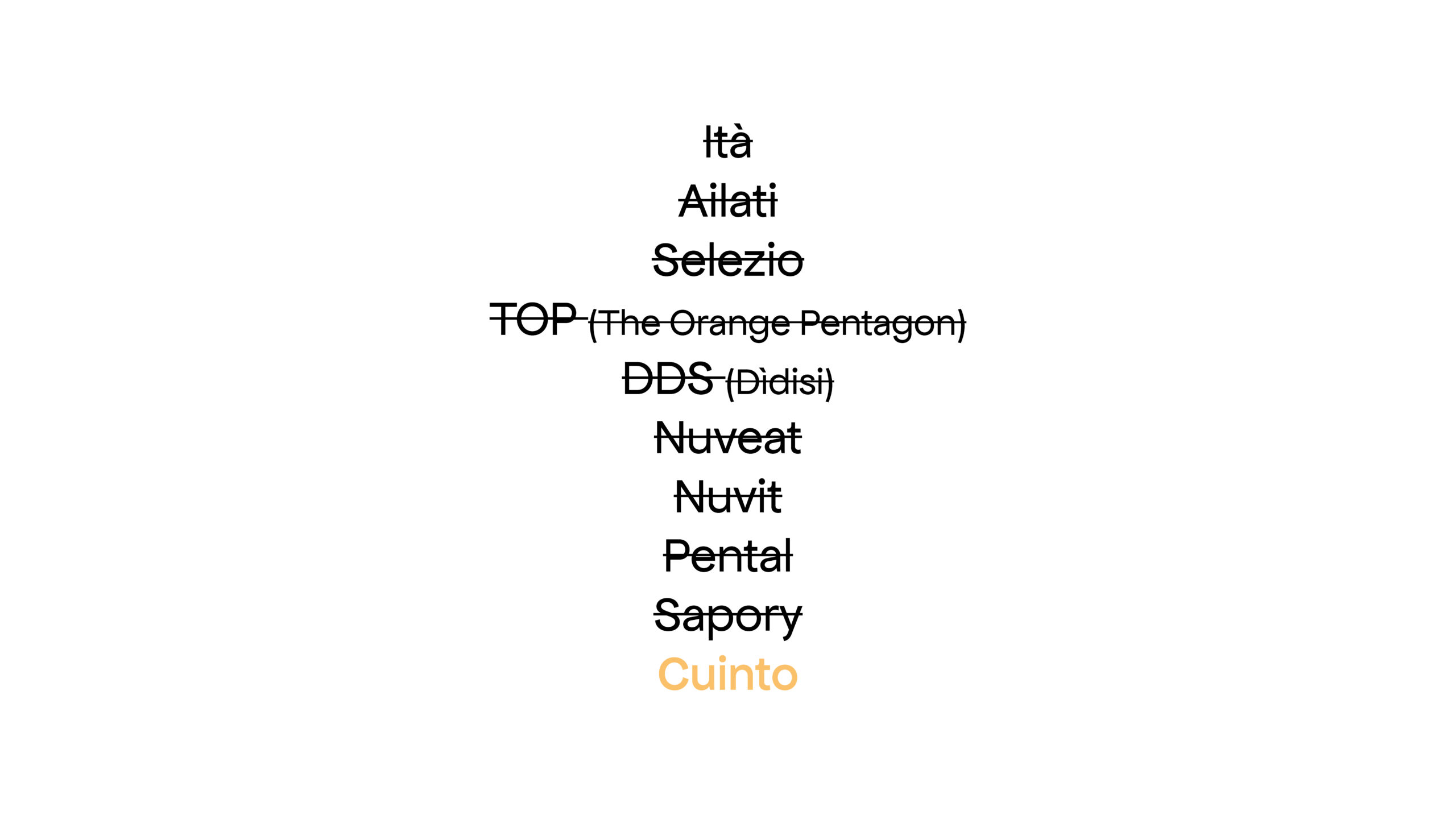
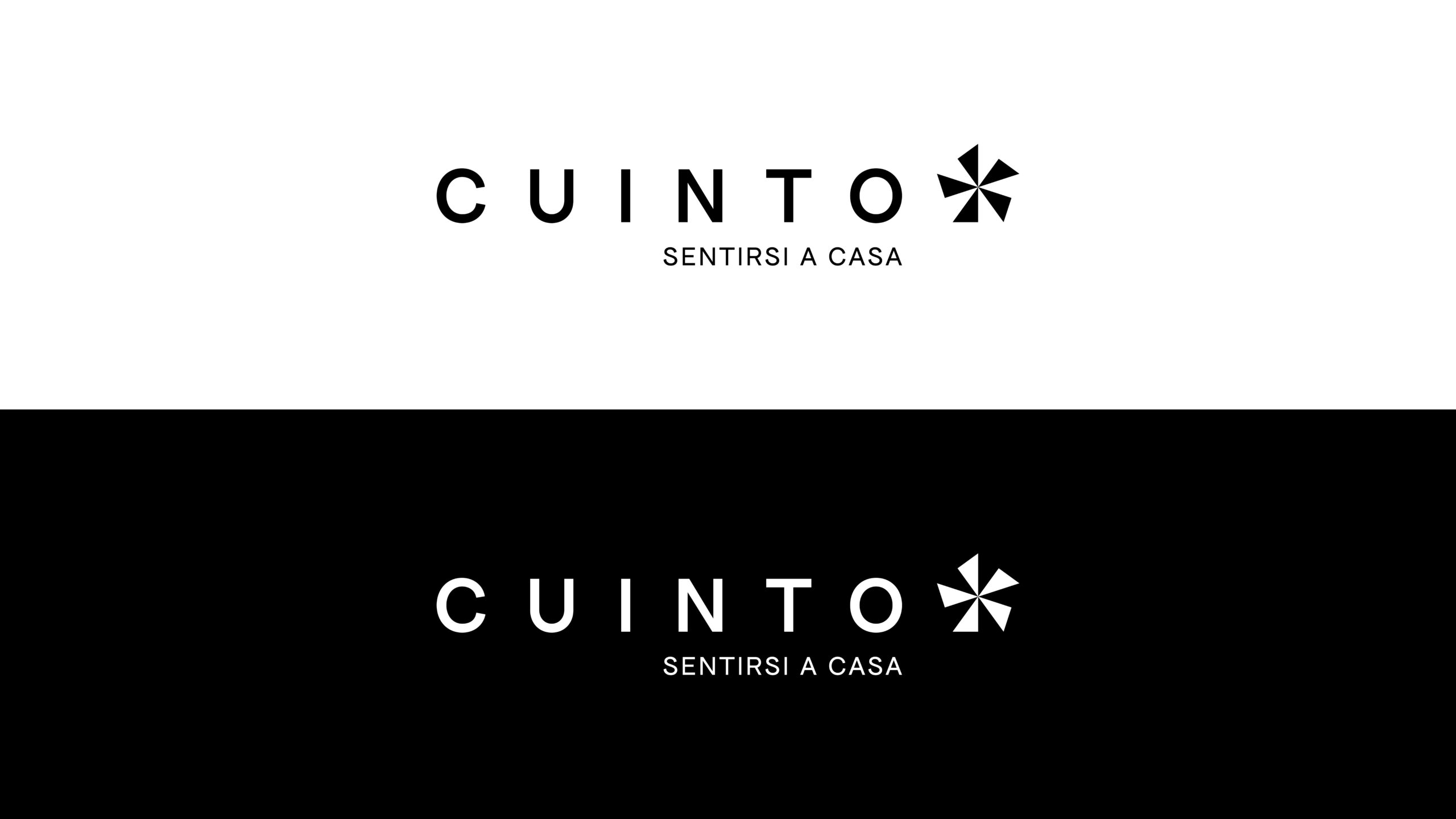
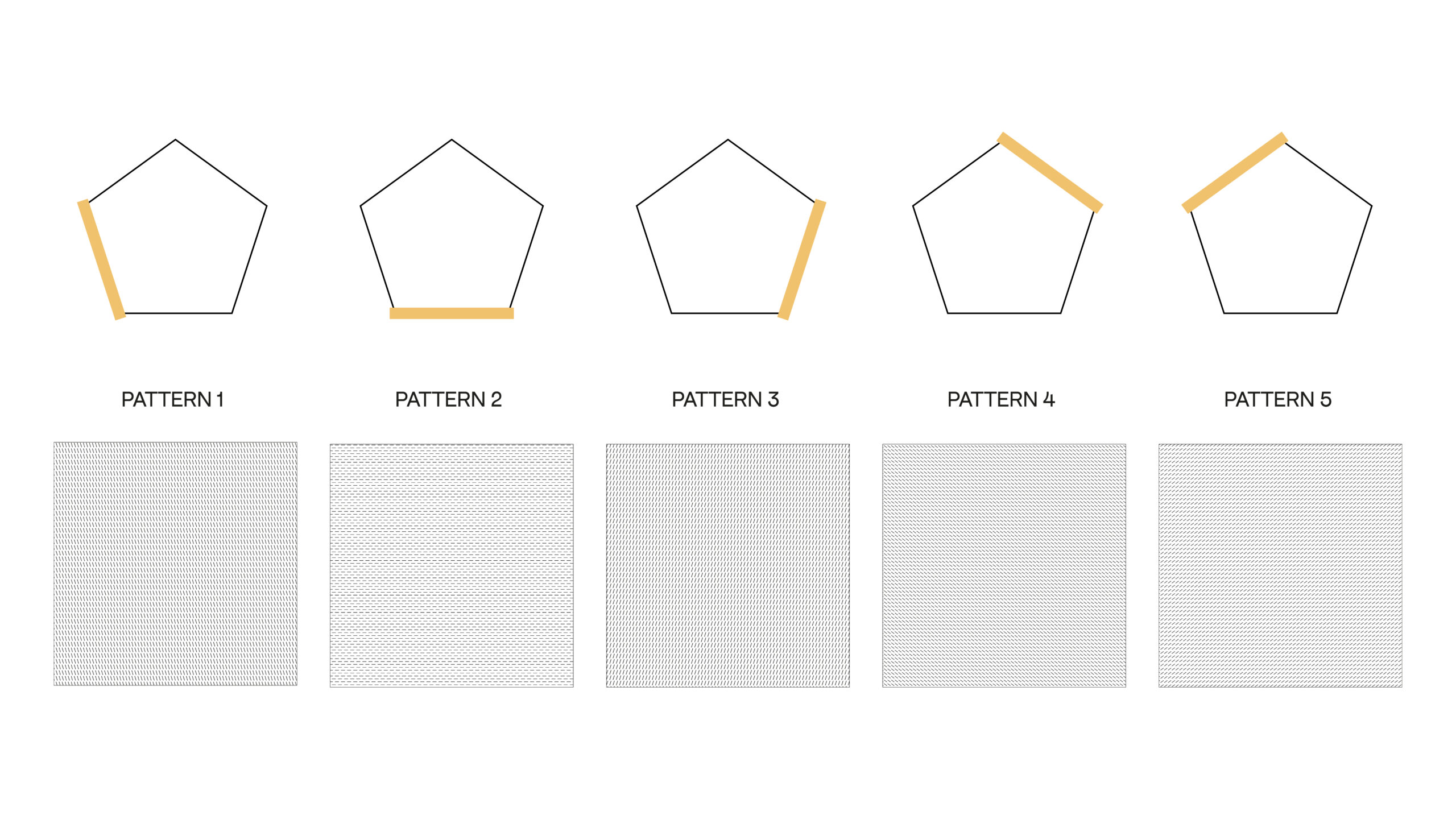
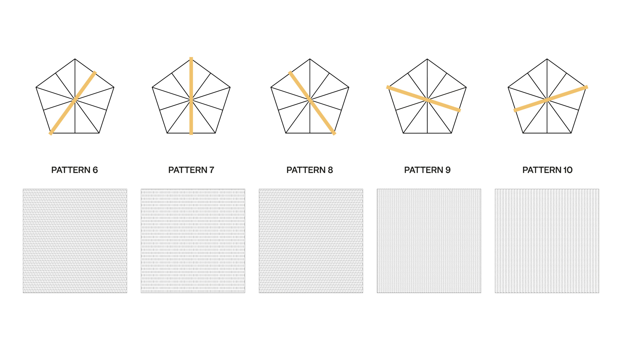
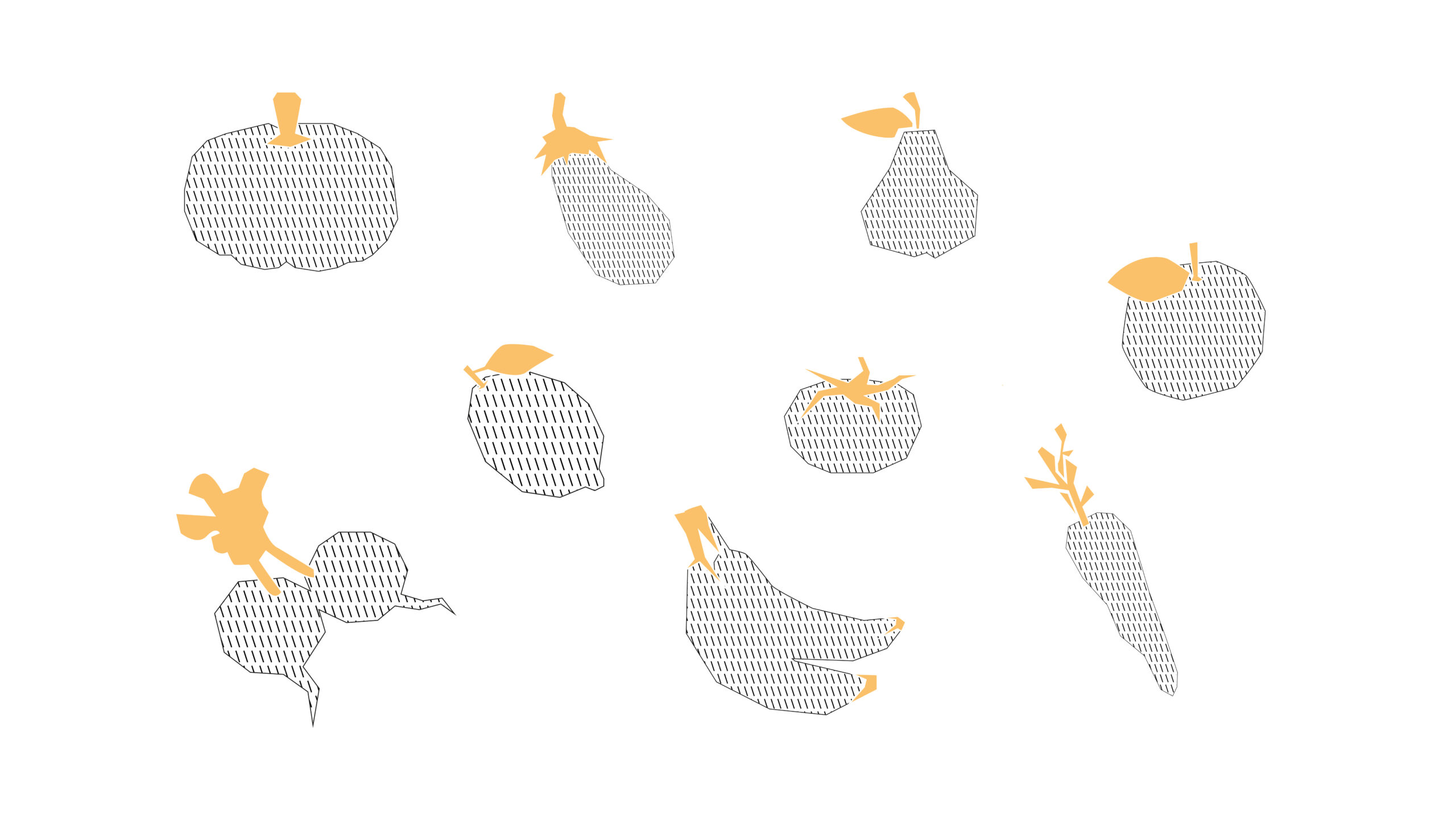
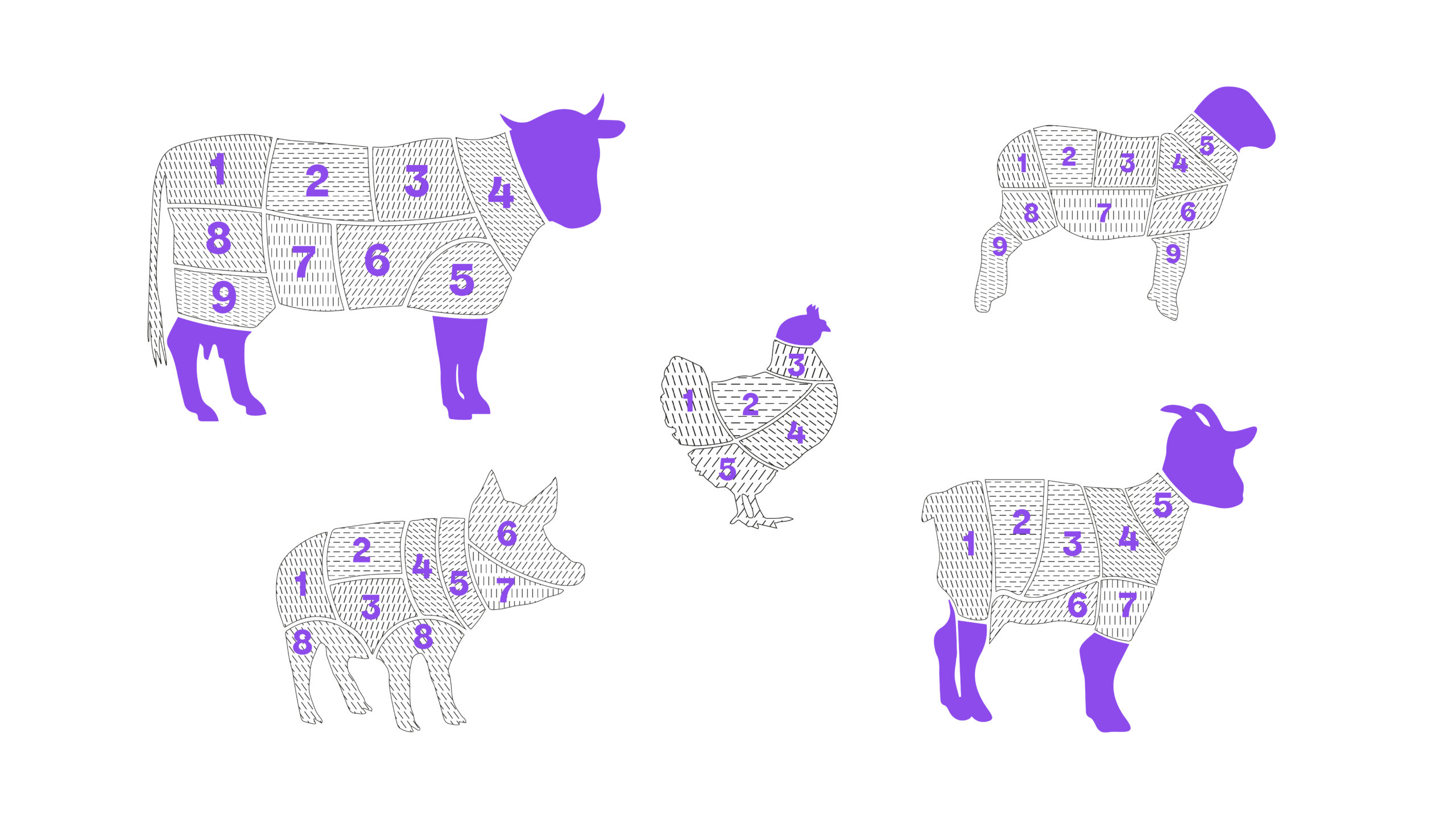
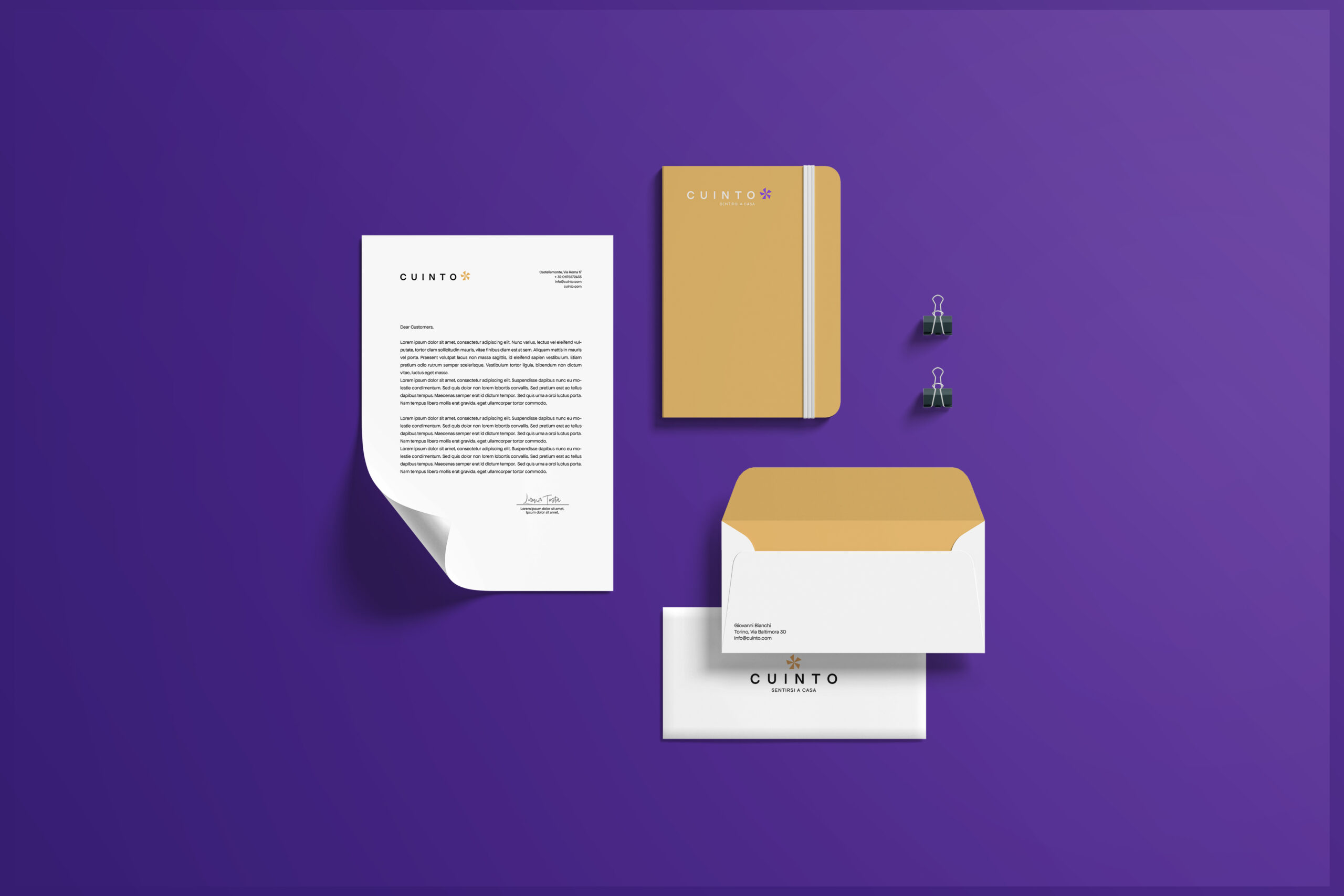
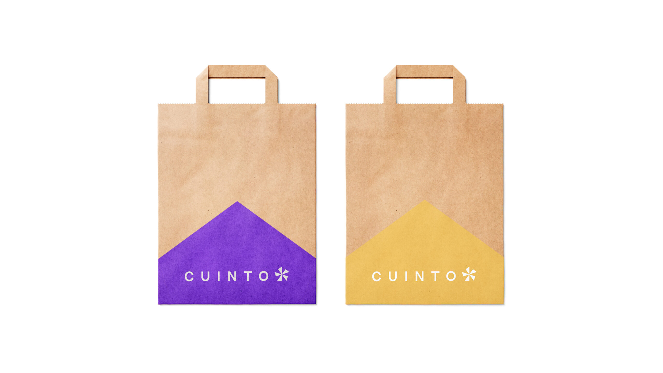
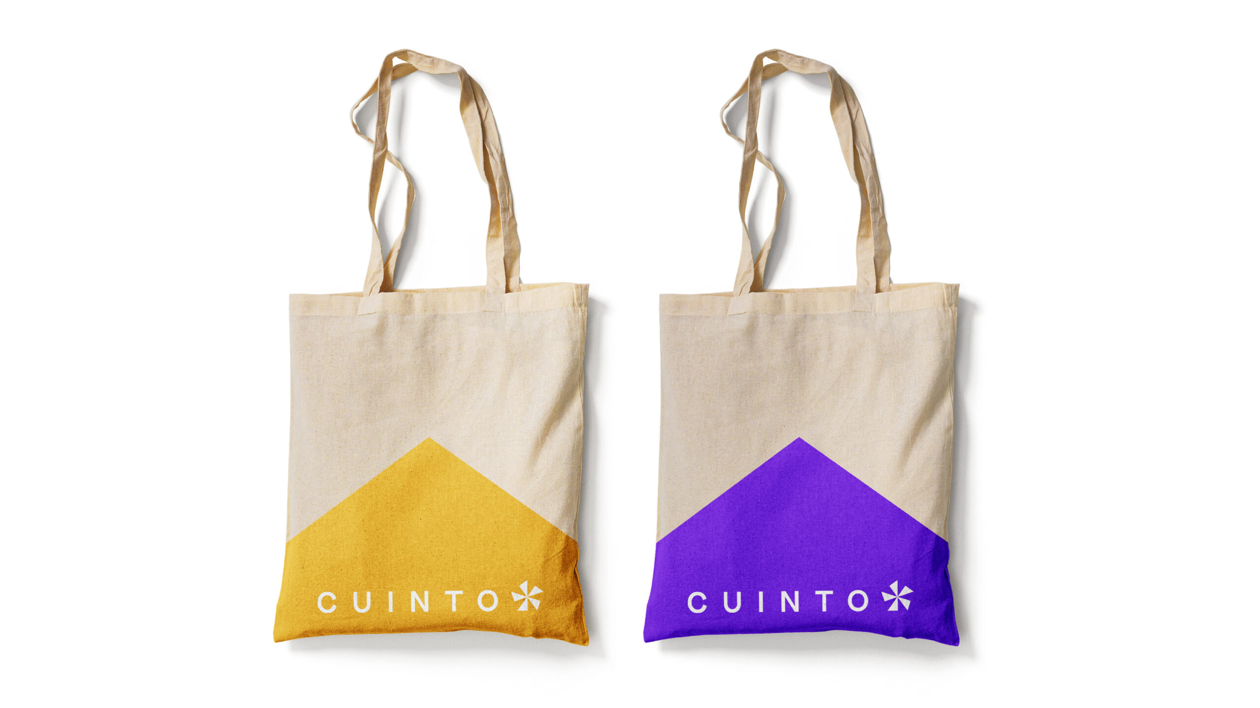
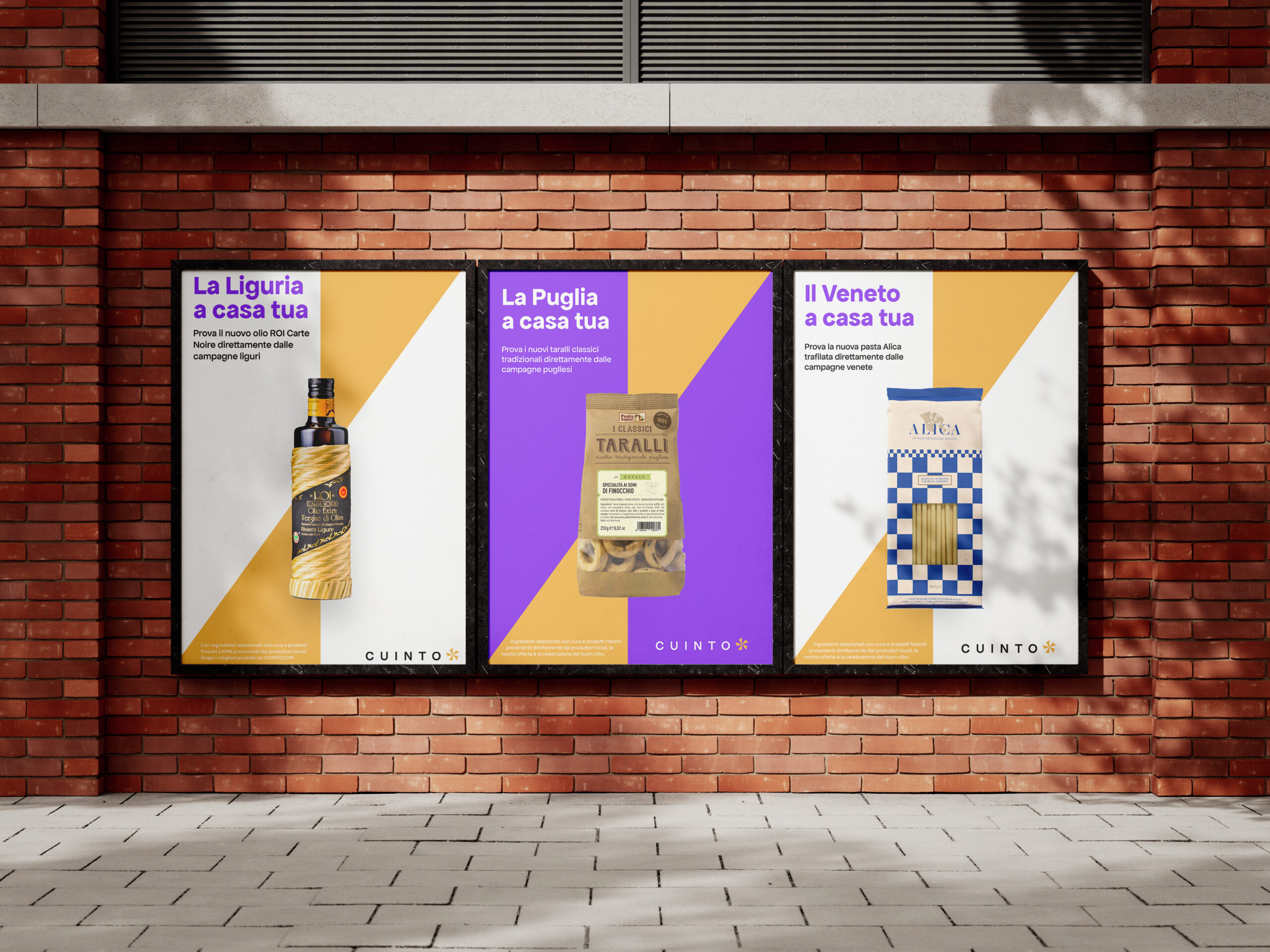
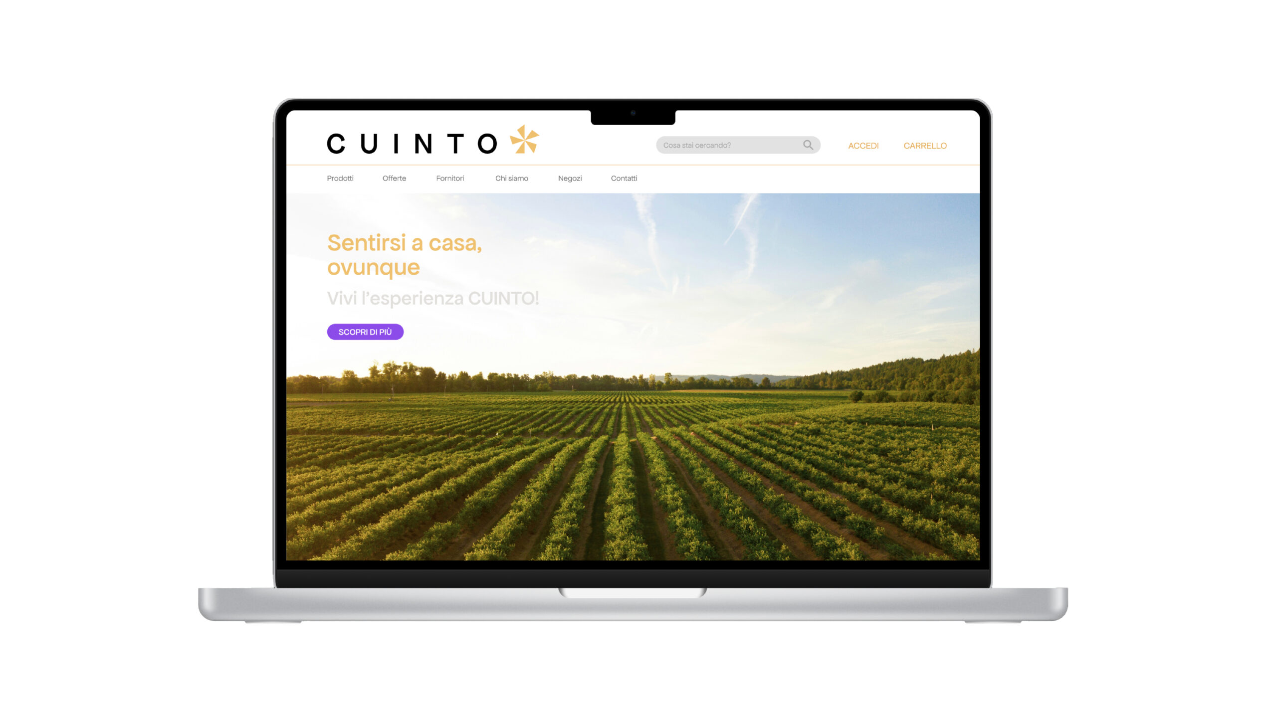
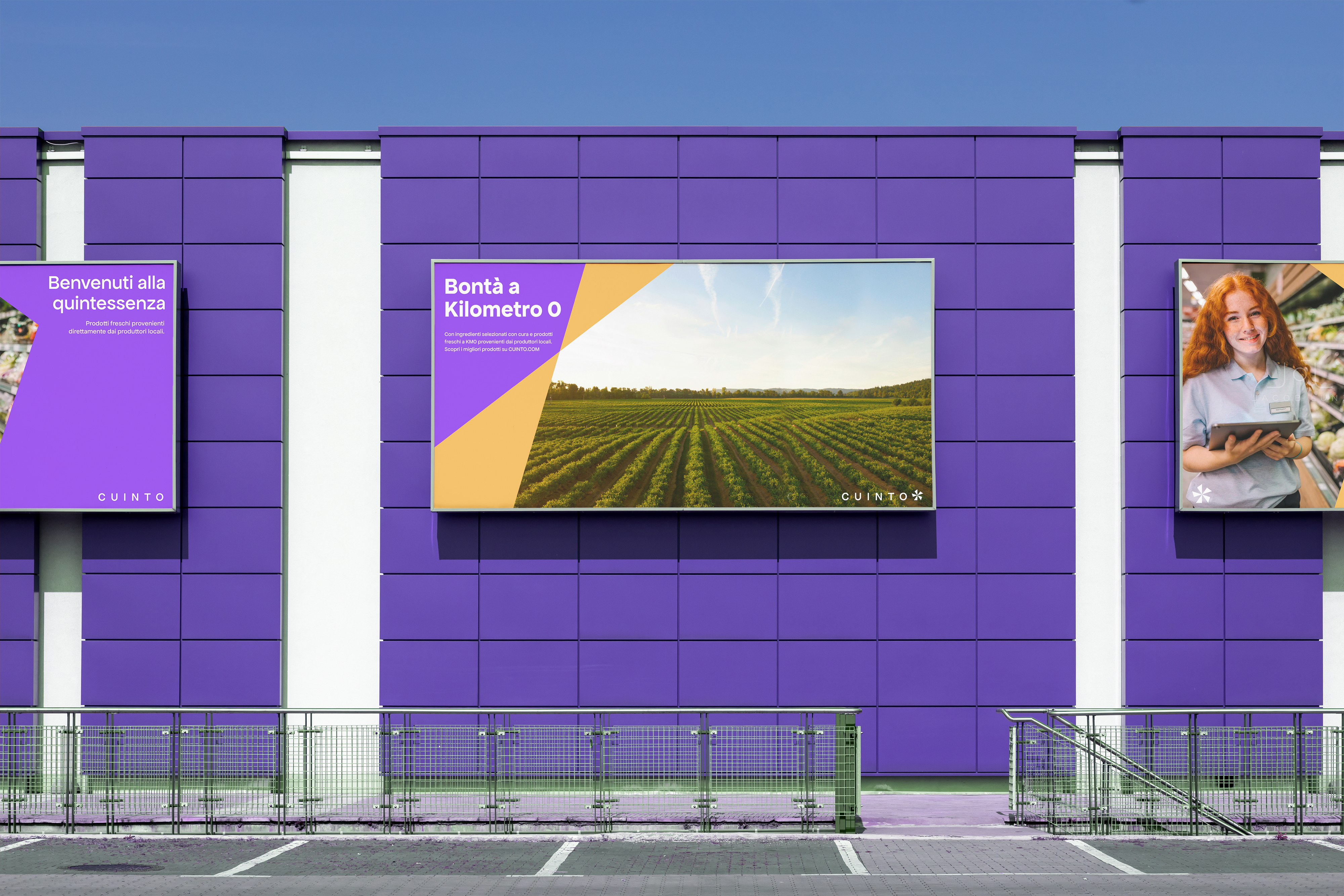
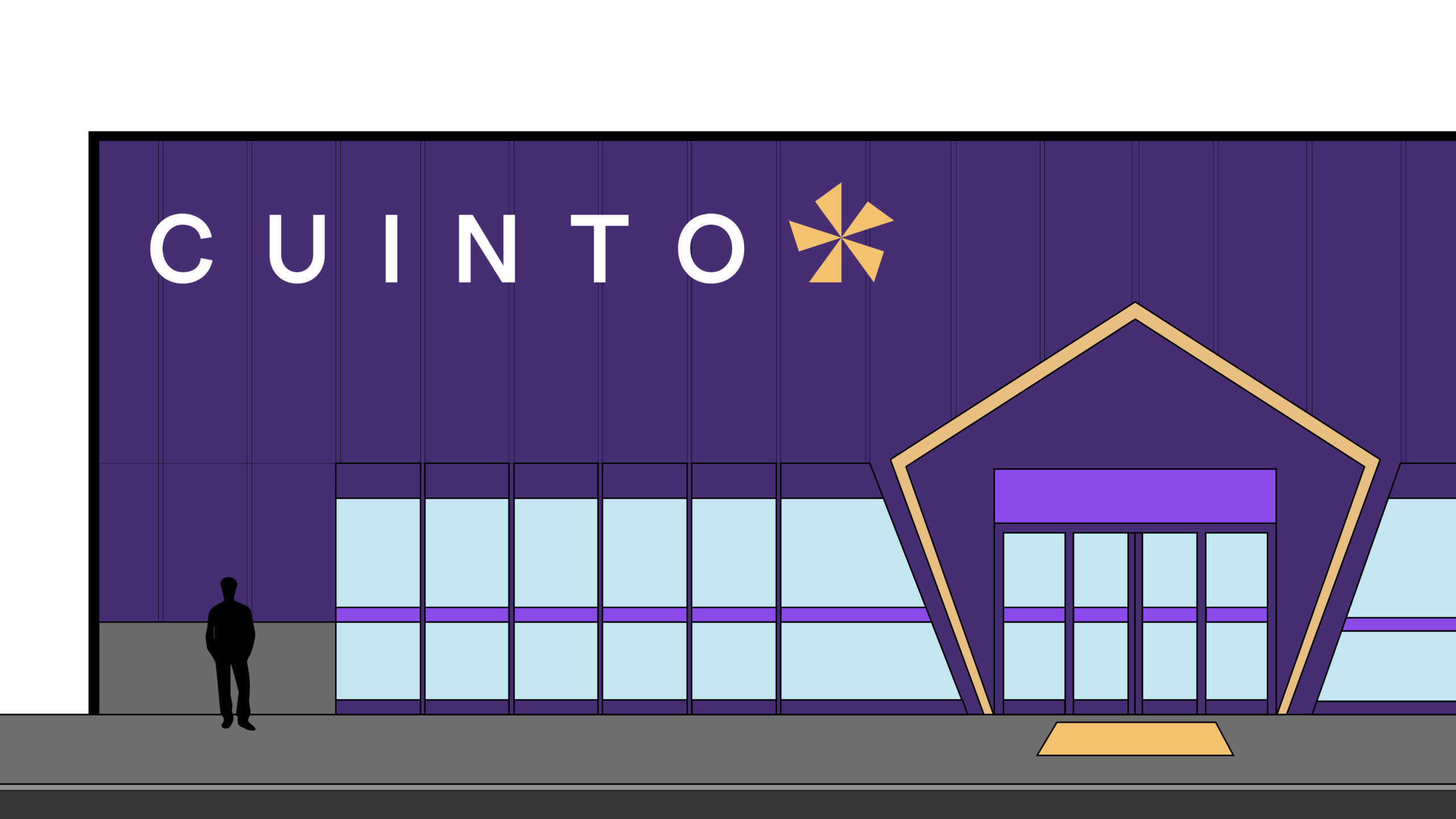
CUINTO is a brand identity concept developed for a high quality Italian supermarket, focused on the exclusive sale of food, with a strong commitment to local and sustainable products. The name takes inspiration from the pentagon, the symbol of the project, linked to its 5 sides and corners.
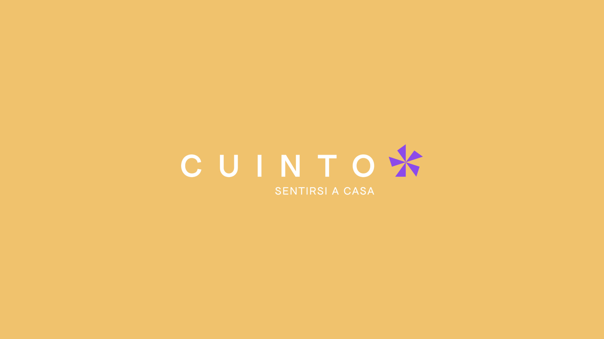
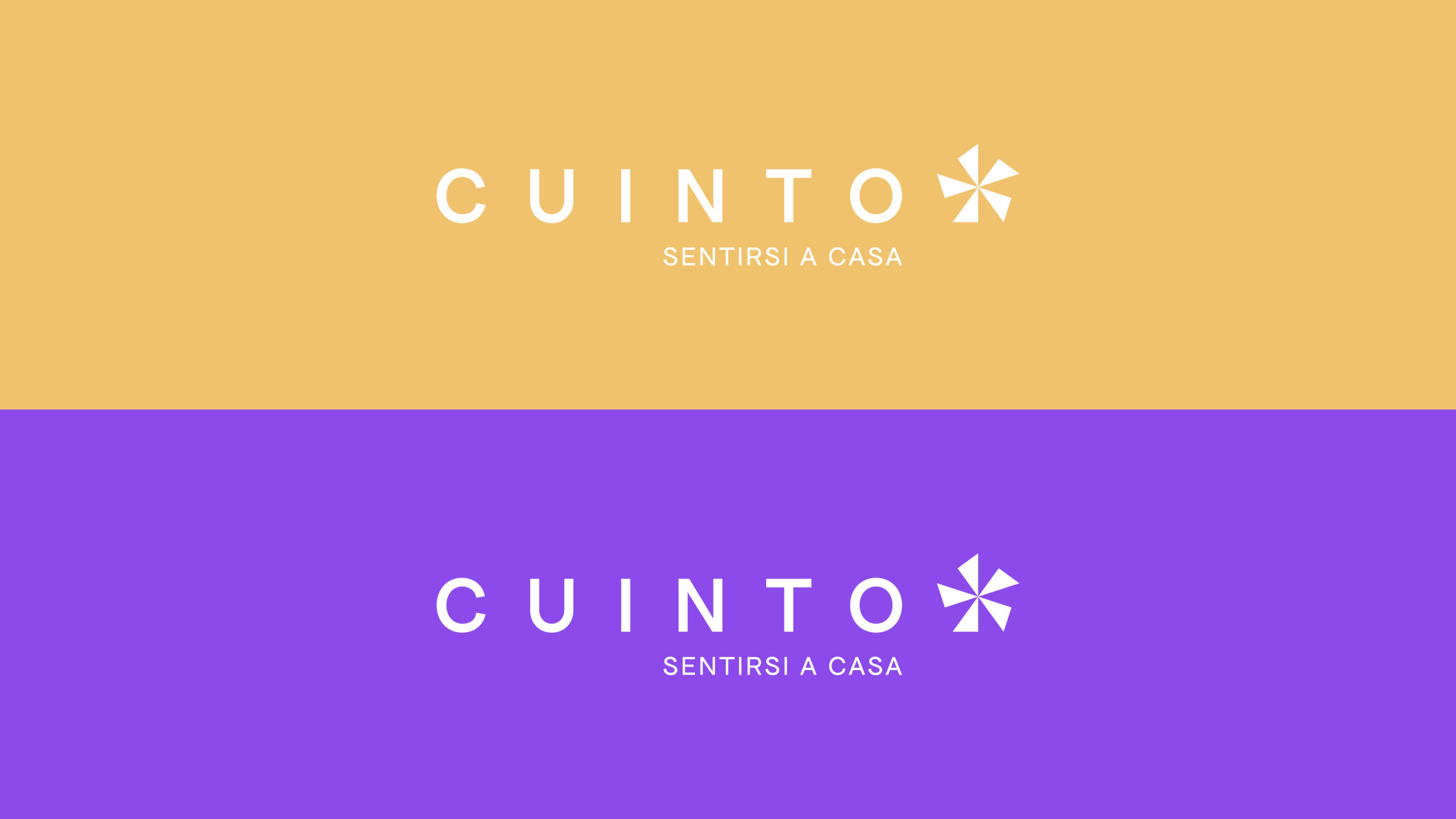
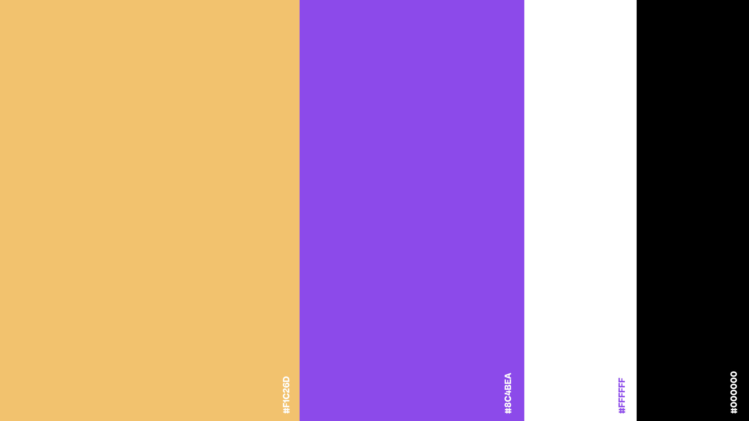
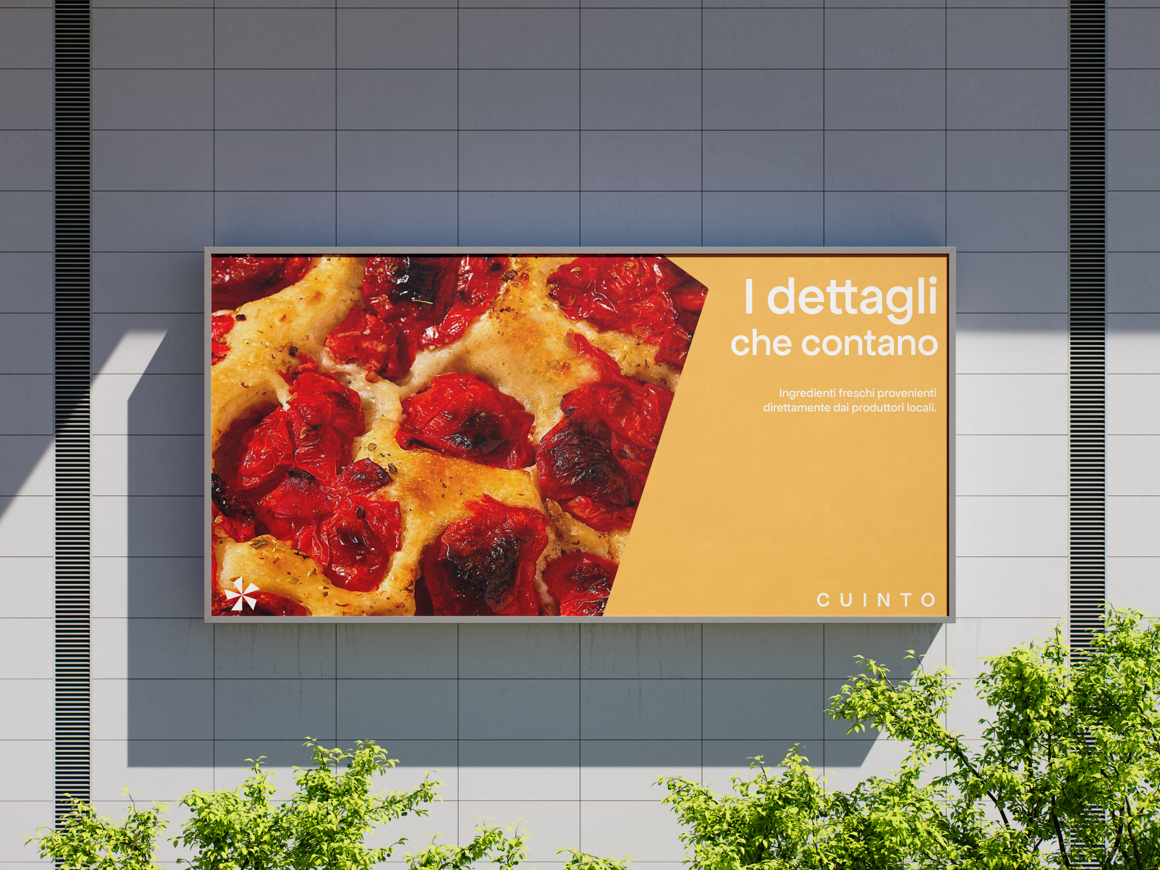
The brief called for elements that could not be changed: the pentagon, the colour yellow ochre and the theme of GDO. These were complemented by a bold and distinctive purple, which creates a dynamic visual contrast. This colour combination enhances the uniqueness of the brand, making it recognisable in the large-scale retail landscape.
Collaborator of the project: Michele P.